Project Context
Multiple A/B campaigns for Fritz Fryer to optimize subject lines, CTA text, and layouts.
Role
Defined test variables, set up A/B splits in Campaign Monitor, and analyzed results via GA4/UTM.
Key Learnings & Next Steps
- One Variable at a Time: Isolating subject lines vs. layout prevented confounding results.
- Statistical Significance: 20% audience splits hit significance in ~4 hours—next round, test 30% splits for faster wins.
- Documentation: Building a “Subject Line Swipe File” saved 2 hours of brainstorm time per month
- Tools Used: Campaign Monitor · Mailchimp · GA4 · Google Optimize · Figma
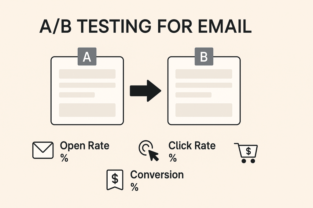
What Is A/B Testing in Email?
A/B testing (also known as split testing) in email marketing is the process of comparing two versions of a single variable—such as subject lines, CTA buttons, or layout blocks—to see which performs better.
Why do it? Because gut instinct doesn’t beat data-backed decisions. A/B testing helps you increase open rates, clicks, and conversions, often with very small design or copy tweaks.

What You Can A/B Test
Here’s a breakdown of elements you can test at different levels:
1. Subject Lines
- Length (short vs. long)
- Urgency vs. curiosity
- Use of emojis or personalization
One of my subject line tests led to a 2,800% increase in click-through rate for Fritz Fryer.
2. Preview Text
Often overlooked, but important!
- With vs. without preview
- Emotional vs. feature-based lines
3. CTA Buttons
- Copy: “Shop Now” vs. “Get Yours” vs. “Grab My Discount”
- Placement: Above the fold or after product list
- Style: Ghost button vs. solid block
- Color contrast and padding (especially for mobile)

4. Layout & Design
- Single-column vs. product grid
- Hero image size
- Text on image vs. below image
- Use of whitespace or dividers
On mobile, even small layout changes (e.g., stacking product blocks vertically) can significantly improve tap-through rates.
5. Send Time
- Morning vs. evening
- Weekday vs. weekend
- Time zone segmentation
Combine with GA4 to track post-click behavior for each send time.
6. Personalization
- With or without name
- Dynamic product recommendations
- Location-based content
How I Run A/B Tests
Here’s my typical A/B testing setup in tools like Mailchimp or Campaign Monitor:
| Step | Task |
|---|---|
| 1 | Decide which variable to test (one at a time!) |
| 2 | Set goal: opens, clicks, or conversions |
| 3 | Design two email versions |
| 4 | Define test audience split (e.g. 20% A / 20% B) |
| 5 | Let the rest (60%) receive the winning version after X hours |
| 6 | Monitor GA4 or UTM links to track post-click actions |
Interpreting Results
Key Metrics to Watch:
| Metric | Tells You |
|---|---|
| Open Rate | Subject line strength |
| CTR | CTA & layout strength |
| Click-to-open rate (CTOR) | Engagement quality |
| Conversion Rate | Overall effectiveness |
Statistical significance matters! Don’t declare a winner until you’ve hit enough opens or clicks to validate.
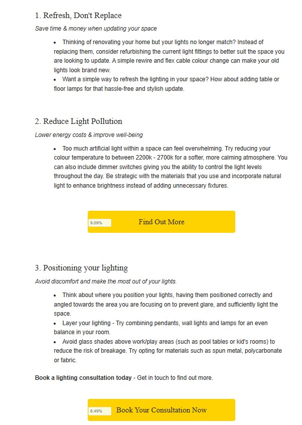
Sample Test Result: “January Sale” Campaign
| Variable | Version A | Version B | Winner |
|---|---|---|---|
| CTA Text | “Shop Now” | “Claim My Discount” | B |
| CTR | 0.14% | 4.2% (+2,800%) |
Bonus: Quick Test Ideas for Beginners
| Element | Try This |
|---|---|
| Subject Line | “Big News Inside” vs. “30% Off: Today Only” |
| Image | Static vs. animated GIF |
| Product Order | Bestsellers first vs. new arrivals |
| Footer | With social icons vs. without |

Final Tips
- Always test ONE thing at a time
- Use a large enough sample size
- Be consistent (e.g., test every 2–4 campaigns)
- Track long-term trends, not just wins
SEO Case Study: Optimising Skylight Lighting Blog for Organic Growth
This SEO case study showcases how I optimised an underperforming blog for Fritz Fryer Lighting by combining keyword strategy, metadata, and UX layout improvements. Through targeted keyword research, on-page SEO fixes, internal linking, and accessibility enhancements, I transformed a visually rich but invisible blog into a high-ranking, conversion-driven asset. The result? A 38% increase in…
The Anatomy of a High-Performing Promotional Email
Ready to turn browsers into buyers? In this post, I’ll break down the anatomy of a high-performing promotional sale email, designed to grab attention, drive urgency, and boost conversions. From compelling headlines to strategic product placement, discover how to design sale emails that not only look great but sell smarter.
Welcome Emails that Convert: First Impressions Matter
Your welcome email is your first impression, make it count. In this post, I unpack the essentials of a high-converting welcome email, including structure, messaging, and design tips.
Whether you’re introducing a brand story or driving that first click, learn how to create a warm, strategic welcome that sets the tone and drives engagement…
